Meaningful agentic loops
A short technical note on turning an agent prompt into a measurable product improvement loop with UI/UX evidence, scores, screenshots, and stop rules.
 Codex
Codex  GitHub
  Browser
 Loops are all the rage in agentic engineering right now.
That makes sense. Making agents run longer, with less supervision, is the obvious way to get more done as an engineer. If an agent can evaluate a product flow, scope UI/UX improvements, implement them, check whether the experience actually improved, and repeat, it stops being a fancy autocomplete session and starts looking like a teammate.
But useful end-to-end loops are harder than they sound.
Real product work crosses boundaries. Product defines the user goal. Design judges whether the interface serves that goal. Engineering changes the system. QA verifies that the flow still works. Useful loops need to move across those roles: evaluate the product, identify design improvements, implement scoped changes as an engineer, check progress like QA, and then decide what to do next.
Most agent loops fall apart at those handoff points because the agent has no shared artifact that product, design, engineering, and QA can all trust. The loop needs a goal, evidence, a scoring signal, a place to write state, a way to change the system, and a reason to stop. Without that structure, “improve the UI” becomes taste. With it, the agent can inspect the same flow, score it, make a bounded change, rerun the flow from a clean browser state, and decide whether the change helped.
The stop condition is what makes the loop practical. It can be concrete: improve the flow score by 10%, iterate until the flow reaches 100, raise the weakest principle above 85, or specifically improve “Simplicity” without harming clarity, contrast, responsiveness, light/dark mode, or interaction cost. Once a flow has a graded rubric, the agent has something it can actually iterate against until useful improvements are complete.
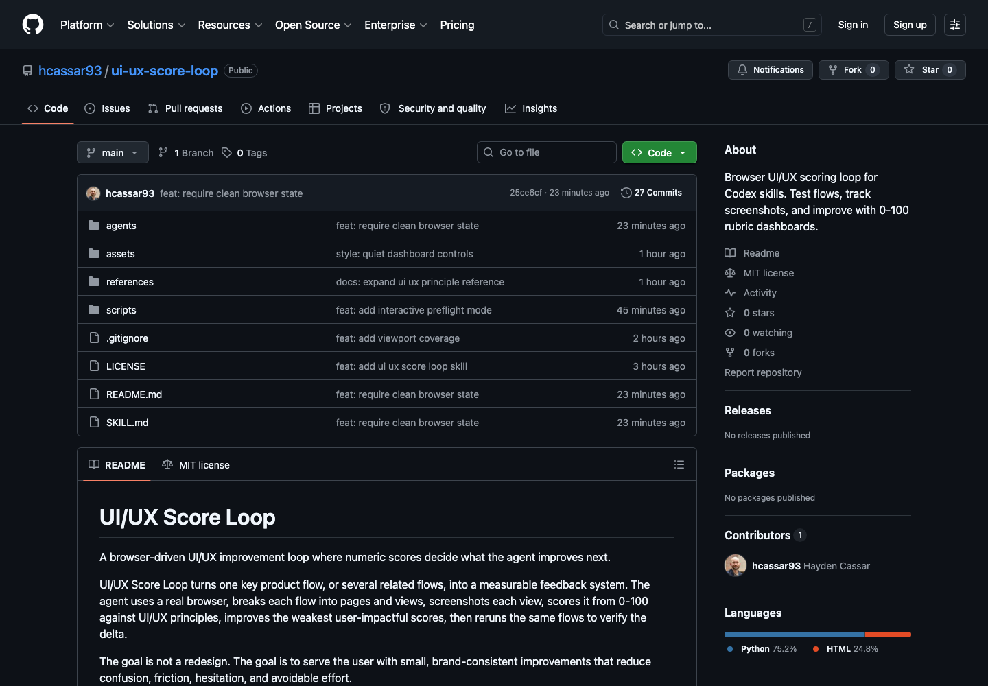
I built an open-source version of that pattern for UI/UX product improvement: UI/UX Score Loop. It is both a copyable prompt and a Codex skill with a dashboard helper.
Contents
- Why a loop
- The shape
- The dashboard
- The rubric
- The controls
- Operationalizing it
- Publishing it
- The useful part
- Install it
Why a loop
Agents are good at continuing. That is useful, and dangerous.
For product work, continuation without a measurement loop usually produces vague polish: bigger headings, softer shadows, decorative gradients, more cards, more motion, more “AI taste.” The work may look busier while the user experience gets no clearer.
The loop constrains the agent to a smaller claim:
This specific flow, at this breakpoint and mode, became easier for this user goal by this much.
That claim needs evidence. It needs before and after screenshots. It needs notes about why a score moved. It needs clean browser sessions so cached auth state does not hide friction. It needs the same entry point each run. It needs enough range to cover responsiveness, light/dark mode, recovery paths, loading states, and the ordinary places where users get stuck. It needs a stop rule.
That is the difference between an agent doing design vibes and an agent making measurable product improvements.
The shape
The loop breaks one or more user goals into a hierarchy:
Flow
  Page
    View
    View
  Page
    View
    View
A flow is a user goal, not a route. “Login” does not mean jump straight to /login. A real user may start at /, follow a sign-in button, mistype credentials, wait through loading, see an error, reset a password, and then land inside the product.
The loop tries to audit that human path, not the shortest path an agent can infer.
Each run creates state under a gitignored folder:
.ui-ux-score-loop/
flows/
login/
dashboard.html
data/
state.json
ratings.md
screenshots/
iteration-000/
phone/
light/
001-home-entry.png
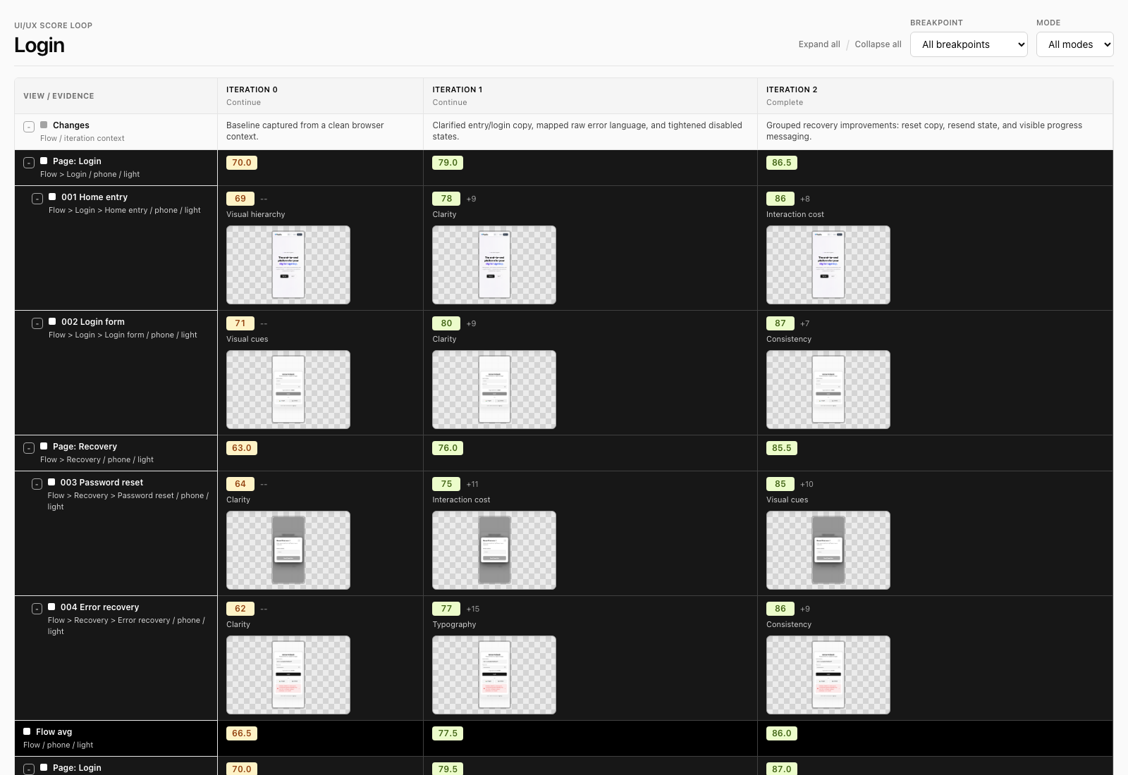
002-login-form.pngThat structure matters. The dashboard is not a report generated at the end. It is the working memory of the loop.
It also makes parallel work possible. Because each flow has its own state, screenshots, and dashboard, a parent agent can split related flows across subagents: one agent can refine login, another signup, another password reset or checkout. The dashboards stay separate, but shared components and copy can still be compared before changes are merged so the product improves consistently rather than one flow at a time.
The dashboard
The dashboard is intentionally dense.
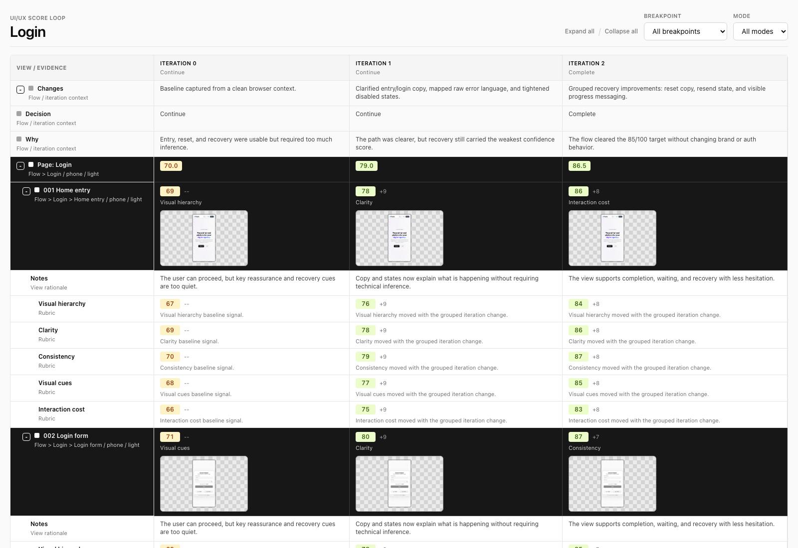
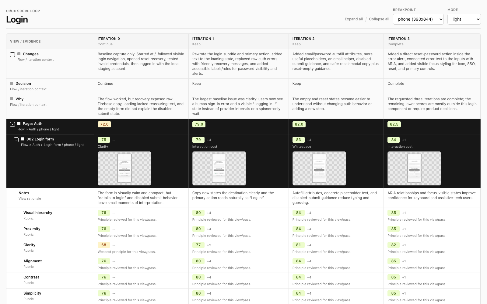
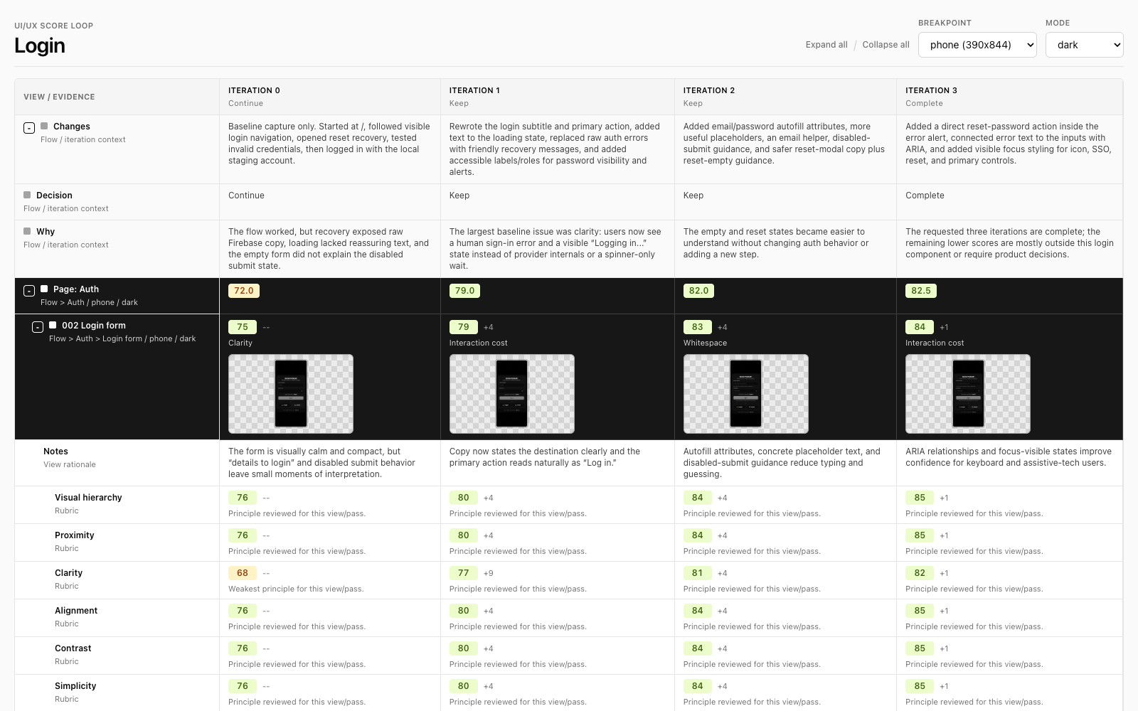
Columns are iterations. Rows are the flow/page/view hierarchy. Each view shows the score, weakest principle, delta, notes, and screenshot thumbnail for that iteration. Page and flow scores are averages, so the agent can target the weakest user-impactful area without losing the overall picture.
The dashboard also has filters for breakpoint and mode because a flow can be good on laptop/light and weak on phone/dark. Responsiveness and light/dark behavior are first-class scoring dimensions, so the loop can improve the same flow across screen sizes and color modes instead of accidentally polishing only the agent’s current viewport.
Screenshots are stored by iteration, breakpoint, mode, and numbered view so they sort naturally:
screenshots/iteration-002/phone/dark/003-password-reset.pngThe rubric
The scoring uses a 0-100 range because small deltas matter when the model is deciding what to improve next.
The principles come from a compact UI/UX playbook: visual hierarchy, proximity, clarity, alignment, contrast, simplicity, whitespace, layout, balance and harmony, consistency, visual cues, depth and texture, color theory, typography, and interaction cost.
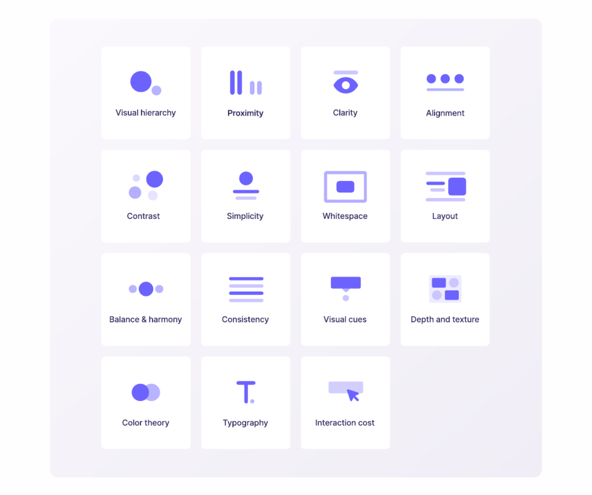
The most important rubric rule is not aesthetic. It is service:
Does this help the user accomplish their real goal with confidence, speed, and dignity?
That means penalizing agent-only affordances: hidden routes, assumed knowledge, silent waiting, console-only errors, raw technical messages, unclear recovery, and states that only make sense because the agent can infer what happened.
The controls
The skill has a few controls because different flows need different levels of inspection.
| Control | Default | Why it exists |
|---|---|---|
| Interactive mode | auto | Ask a preflight when the request is underspecified; proceed when the user already gave enough boundaries. |
| Completion | required | Stop at a target score, percent improvement, or max iteration count. |
| View granularity | standard | Decide how aggressively to split pages into states, modals, errors, loading, hover/focus, and recovery views. |
| Improvement intensity | grouped | Decide whether each iteration changes one issue, a few related issues, or all safe issues per view. |
| Related flows | separate dashboards | Let subagents refine multiple flows at once while preserving a shared consistency review. |
| Breakpoints | phone, tablet, laptop | Catch responsive failures instead of scoring only the agent’s current viewport. |
| Modes | discovered | Evaluate and improve light/dark automatically when the app supports them. |
| Browser state | fresh | Start each iteration/breakpoint/mode pass in a clean context so auth state does not fake progress. |
These controls are not there to make the prompt longer. They are there to keep the loop honest.
Operationalizing it
The same loop can run on demand, on a cron schedule, or inside CI/CD.
In CI, the useful mode is not “redesign the page.” It is “audit these flows and fail if the score drops below the threshold.” A team could set minimum ratings for login, signup, checkout, onboarding, or account recovery, then block a release when a change harms a critical breakpoint, color mode, page, or view.
On a cron job, the loop becomes a slow product-health monitor. It can rerun key flows against staging or production, capture fresh screenshots, compare them to the previous dashboard state, and flag regressions before users report them. Because the data is nested by flow, the same system can watch multiple flows at once and spot consistency drift across shared components.
The important distinction is that CI and cron runs should usually be audit-first. Let the loop measure, compare, and report. Let a human or a separate improvement run decide when to apply changes.
Publishing it
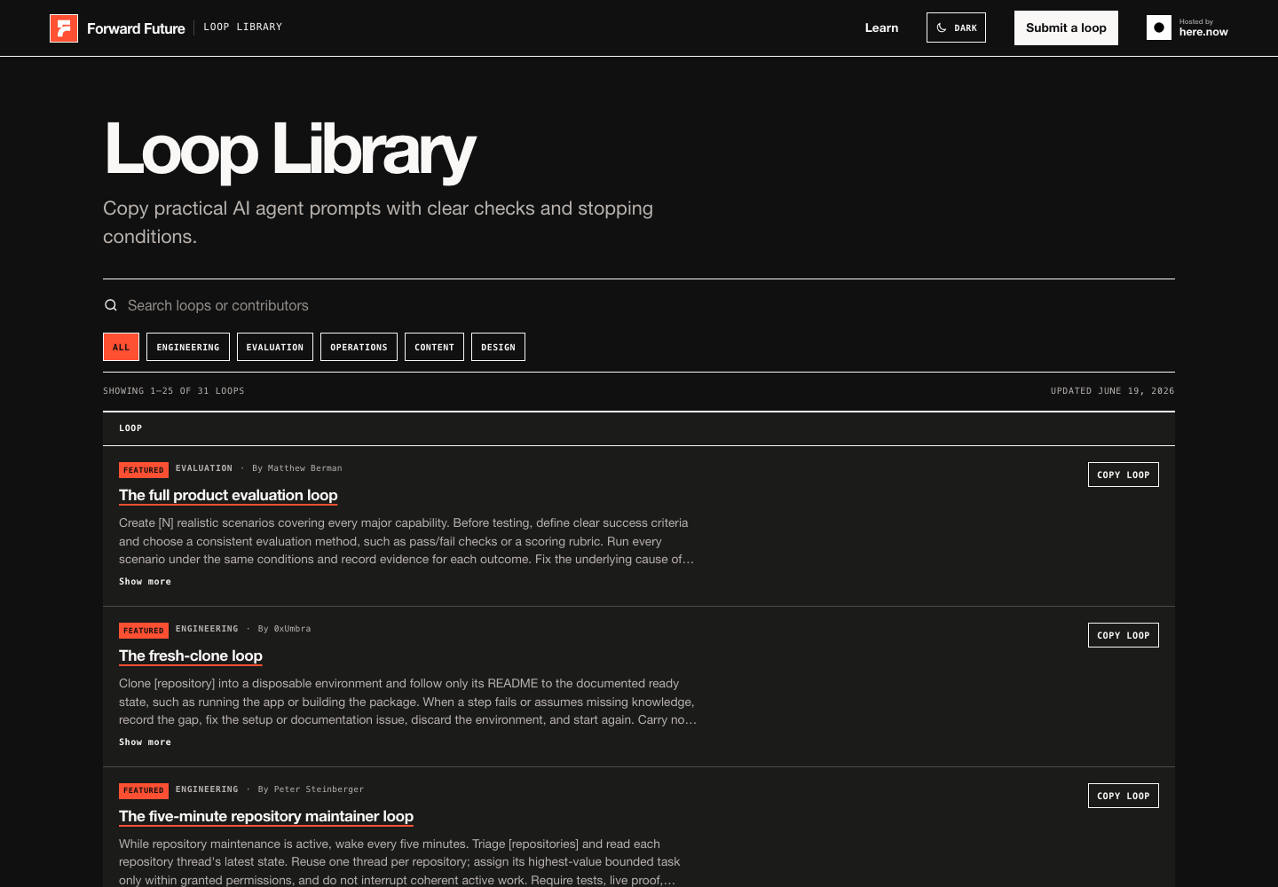
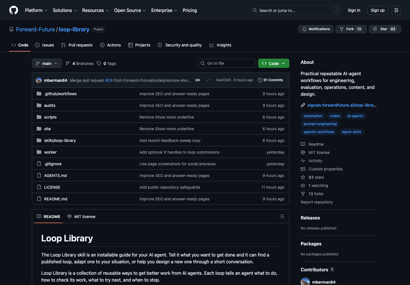
I packaged the loop as an open-source repo and submitted the prompt-only version to the Forward Future Loop Library. The repository is here: hcassar93/ui-ux-score-loop. The Loop Library source repo is here: Forward-Future/loop-library.
The installed skill is the more useful form because it carries the dashboard template, folder convention, principle reference, and helper script. The prompt-only version is still valuable because it makes the loop portable.
The useful part
The interesting part is not that this particular loop audits UI.
The interesting part is the pattern:
- Define a workflow boundary.
- Capture evidence.
- Score the evidence.
- Change a bounded thing.
- Rerun from a clean state.
- Compare deltas.
- Stop when the criterion is met.
That shape applies to UI/UX, evals, support triage, documentation quality, onboarding, QA, sales workflows, and product operations.
The agent becomes more useful when it is not merely asked to improve something. It becomes useful when it is placed inside a meaningful loop.
Install it
The best way to use it is as a Codex skill:
npx skills add hcassar93/ui-ux-score-loop -gThen call it on a real product flow:
Run $ui-ux-score-loop on the login flow.

Start from the user entry point, evaluate phone/tablet/laptop,
include light and dark mode when available, and do 3 iterations.
Scope useful UI/UX improvements, implement them, rerun the flow,
and stop when the dashboard shows the target was met.